This is the time of year for color. From fashion to nature, we see color inspiration everywhere. From an interior design perspective, color is everything. It helps shape how a home looks and feels with the right tones and colors in fabric choices. The newest palette of colors from Pantone has been revealed, and we are here for it. Dreamy, moody, stylish–all the things we love about color and more. Let’s learn more about Pantone and why we know you will love it for your home.
Choosing a Palette
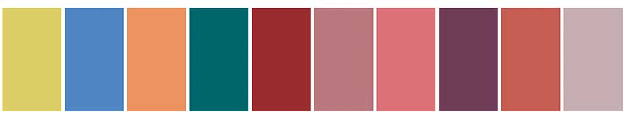
We look to the experts for help as we discuss Pantone, and why it inspires us. Laurie Pressman, Vice President of the Pantone Color Institute, offers that this season’s colors are vibrant, foundational tones. With a range of colors from pinks and purples to blues, greens, and yellows, there are a variety of colors to use in fabric that will inspire your home’s interior.
Staying in Neutral
Choosing color doesn’t mean you have to go wild and crazy with colors (if you don’t want to). Look at the range of neutral color options from this classic palette in various natural shades and tones. Pantone offers these neutral tones as a way to style your life with subdued sophistication, oftentimes bringing inspiration from the natural world.

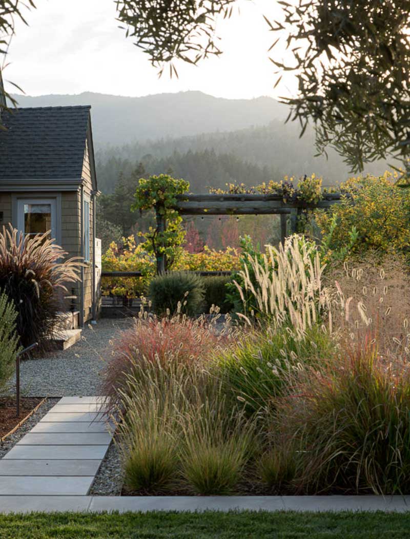
Go with the Inspiration
Nature offers great color inspiration for our homes. With this year’s color palettes, we see how nature comes indoors this season. From natural colors in browns, blues, and greens to a landscape portrait of colors, there are many ways to pair and organize the colors for the home. Home design can feel alive and breathe life into the same spaces in different ways with the right colors.
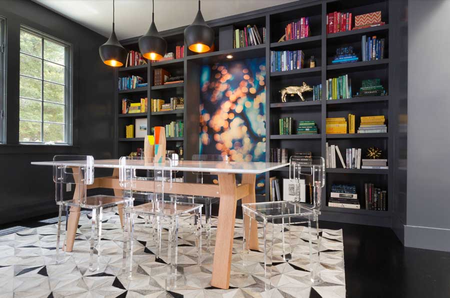
Dining Room Inspiration
Each dining room holds its own space. With the right design, it can feel like the personality of the homeowners, whether that means eccentric and fun or elegant and charming. There is a range to choose from. The dining room’s personality stems from the color choices and their effective use. Looking at this example of how the primary colors in reds, blues, and yellows make the design elements stand out, along with the artwork displayed in the middle. For this year’s color palette, think about how this dining room elevates the interior space with a unique expression. Create a conversation without using any words. Let the space speak for itself!
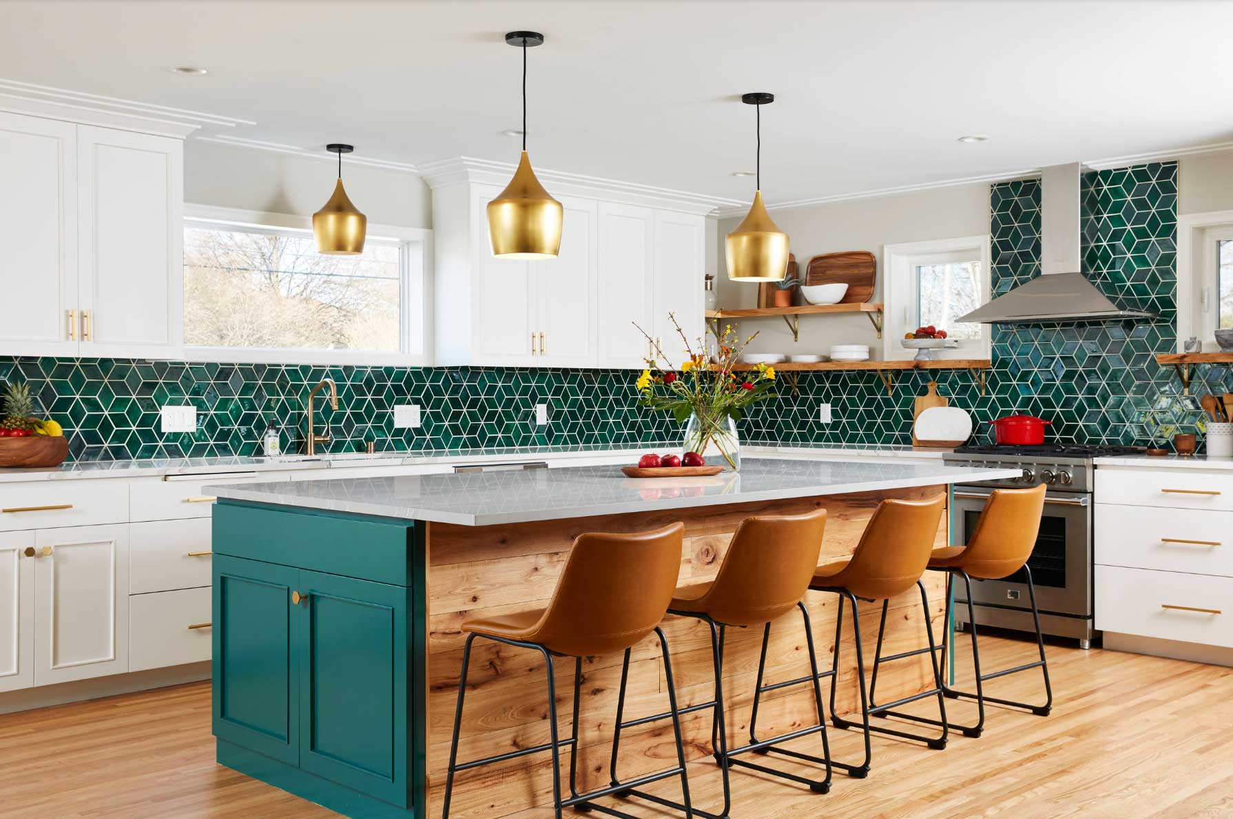
All About the Kitchen
Some say there’s nothing better than a clean-looking kitchen. For many homeowners, that can start with the color. A fresh, clean look with a white backdrop will never go out of style, but that doesn’t mean it’s the only way. Darker kitchens with bright natural light invite an energizing mood. A colorful space with everything in its place–that could be a dream for many! Once you determine the foundation you love, it’s time to bring in accents and design elements. This season, Alexandrite is a great example of enhancing the beauty of a space. Pair it with the right fixtures and window coverings for even more heightened styling.
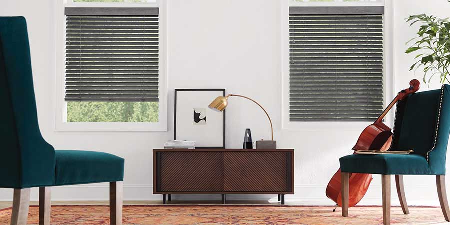
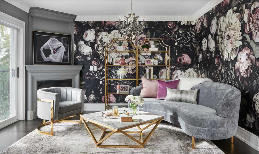
Living Room Comforts
Color inspiration comes in many tones this season, but don’t you love deep, passionate tones? Reds, purples and pinks evoke thoughtful moments of style and grace. Leading the charge this year from the color palette, look at your own space to draw inspiration. Where can these deeper colors create a plush, comfortable feel for your living room? Let us help you design the space with the right window treatments to pair with a beautiful living room.
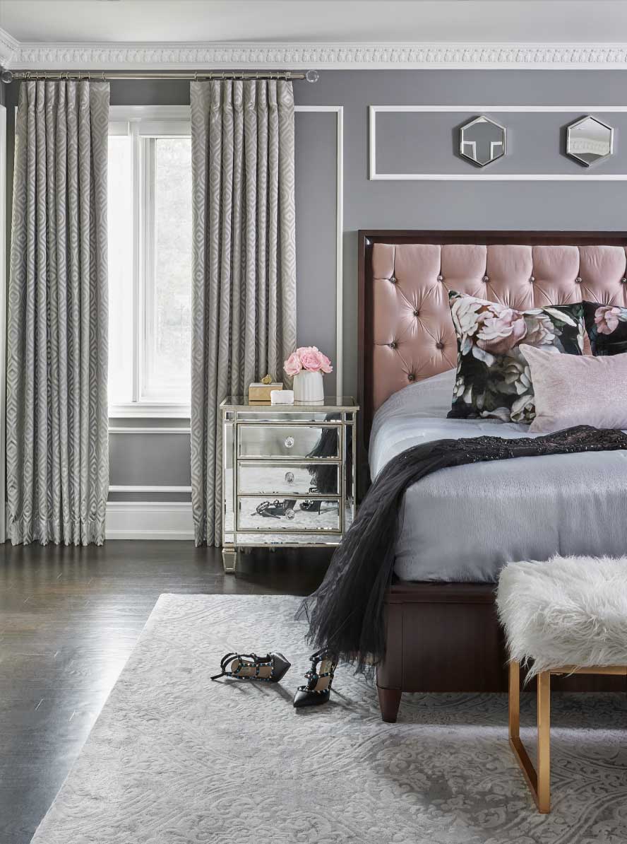
Sweet Dreams Are Made of These
Get ready to settle into a beautiful, comfortable bedroom surrounded by colors and accents. What is more inviting than some calm, neutral colors like gray or dusty rose? Add accent pieces to encourage the entire space to come together in harmony, letting you get a good night’s sleep and rest in a peaceful slumber.
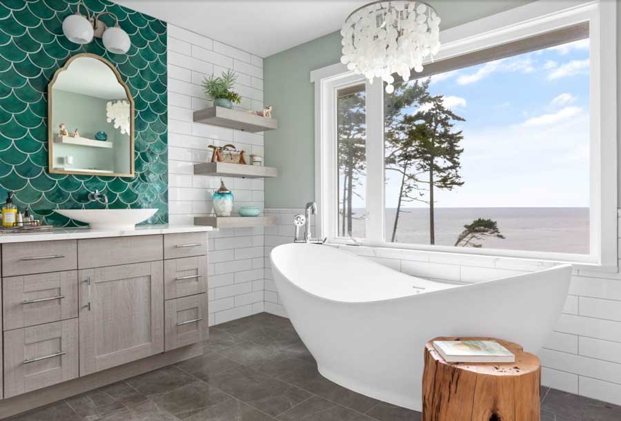
Go Bold with Bathroom Design
Styling a bathroom can feel daunting because it feels like a space that exists only for small moments. But we are here to tell you that bathrooms are having a moment right now, and that is okay with us! Get ready for unexpected style and color showing up in color inspiration, like geometric patterns and deep blue colors. Let this space feel a bit like being transported, even if you don’t spend as much time here as in other spaces.
Get Inspired by Color
The color inspiration this year is exhilarating, and we are eager to see it in your home. Which colors feels inspiring to you? When all else in your world feels hectic, let home be a space where you can unwind and enjoy every moment. At Timan & Co., we are here to help you choose the right colors and styles for your home. Visit a showroom or contact us for an in-home consultation to find out what will work best for your space. Contact us today to get started!